2017 NCES DC Stats Conference: Using Tableau for Displaying Percentile and Regional Data Maps from NAEP Assessments
Date: August 2, 2017

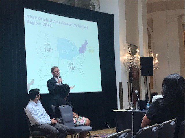
Dr. Brian Cramer and Rahul Rathi, along with Ebony Walton of NCES, presented on using Tableau for displaying percentile and regional data maps from NAEP assessments at the 2017 NCES DC-Stats in Washington, DC on August 2.
The first part of this session discussed the use of percentile maps for reporting the average scores of students across the distribution and present percentile comparisons across subgroups or jurisdictions. Average scores on assessments can be a bit deceiving. While the average score for one racial/ethnic group or jurisdiction could be higher than other racial/ethnic groups or jurisdictions on an assessment, stakeholders may be interested (possibly even more interested) in the percentage of students scoring at different points along the score distribution and how this compares across racial/ethnic groups or jurisdictions. It could be, for example, that the racial/ethnic group or jurisdiction with the higher average score has students scoring lower at 10th percentile compared to other racial/ethnic groups or jurisdictions. Using recent NAEP data, this presentation showed percentile maps for racial/ethnic group average scores at the national level and overall average scores for states using the Tableau data visualization software.
The second part of this session discussed and showed regional NAEP data using Tableau. When NAEP assessments are unable to report data at the state level, examining the data by census region (i.e., Northeast, Midwest, South, and West) can be useful to NAEP stakeholders interested in knowing how students’ in different regions did on assessments. Overall average scores by census region, as well as the distribution of students who engage in and have access to various in and out of school activities, can vary by region. Using recent NAEP data from cognitive items and data collected from NAEP questionnaires, the presentation showed average score differences and variation in engagement in and access to various activities across regions.